
24-12-2025
Logo design is the process of creating a simple visual mark that represents a brand’s personality, values, and promise at a glance. A strong logo helps people recognize you, remember you, and feel something specific when they see your brand.
Logo design is a focused part of brand identity work that turns a business or product idea into a recognizable symbol. It sits at the crossroads of strategy, psychology, and visual design, translating who you are and what you do into a small, consistent mark. When done well, it becomes the foundation for your wider visual identity, from your website to your packaging.
A logo is a unique mark made up of text, symbols, or both that identifies a brand in the marketplace. Its main purpose is not to describe everything you do, but to create instant recognition and emotional association. Over time, repeated exposure to a consistent logo builds familiarity and trust.
A logo acts as the anchor of your brand identity, tying together color, typography, imagery, and tone of voice. It appears on your website, app icon, social media, invoices, and even office signage, so it must feel authentic wherever it shows up. When customers see your logo, they should quickly recall what you stand for and how you make them feel.
Most logos fall into a few classic categories: wordmarks (logotypes), lettermarks, brandmarks (symbols or pictorial marks), abstract marks, emblems, combination marks, mascots, and increasingly, dynamic logos. Each type has strengths depending on your name length, industry, and how you use your logo. Understanding these types makes it easier to choose a direction that supports your brand strategy.
Common logo types include:
Full brand name in a distinctive typographic style.
Initials or monogram when the name is long or complex.
Simple icon or symbol that represents the brand.
Shapes and forms that convey mood or concept more than a literal object.
Text inside a shape, badge, seal, or crest.
Text and symbol paired together.
Character-based or flexible systems that change across contexts.
Effective logo design relies on a few timeless principles rather than tricks or trends. Strong logos are simple enough to recognize instantly, flexible enough to work in many sizes and contexts, and relevant enough to feel “right” for their audience and industry. When these principles are balanced, a logo can stay useful and recognizable for many years.
A simple logo is easier to recognize at a glance and more flexible across different environments. Clean shapes, limited colors, and minimal detail make it easier to scale the logo down for app icons or favicons without losing clarity. Aim for a design that still works when printed very small or shown in one color.
Your logo should feel appropriate for your industry, positioning, and target audience, even if it’s not literally descriptive. A tech startup might lean into clean geometric forms, while a children’s brand might favor softer shapes and playful typography. Visual decisions should support your brand promise instead of fighting against it.
A memorable logo has one clear idea rather than several competing concepts. Distinctive shapes, unusual letterforms, or a small twist in composition can help your logo stand out in a crowded market. The goal is for someone to sketch a rough version from memory after seeing it only a few times.
A professional logo should work on websites, social media, print materials, merchandise, and signage without losing its character. That means designing in vector format, testing in one color and reversed-out versions, and considering both horizontal and stacked layouts. The logo should remain legible and recognizable whether it’s on a billboard or a smartphone screen.
Trends can make a logo feel current, but leaning too hard on them risks looking dated in a few years. It is usually safer to build a timeless core logo and apply trends more lightly in supporting visuals such as illustrations, motion, or campaign graphics. Ask whether your logo will still make sense if the current style wave passes.
Behind every “simple” logo is a structured process that moves from understanding the brand to preparing final files and guidelines. Following clear steps helps you avoid random guesswork, justify design decisions, and collaborate more smoothly with stakeholders. A good process also leaves space for iterations and feedback before locking in the final mark.
Research is the foundation of meaningful logo design. At this stage you clarify the brand mission, values, positioning, and tone, while also studying competitors and visual cues in the industry. Understanding who the audience is and what they care about helps you avoid clichés and find a relevant creative angle.
Once the research is clear, you translate strategic insights into visual ideas. Brainstorming can include word association, mood boards, and collecting references from successful logos in similar or adjacent industries. The goal is to generate multiple concept directions, then narrow down to a few that align best with the brand story.
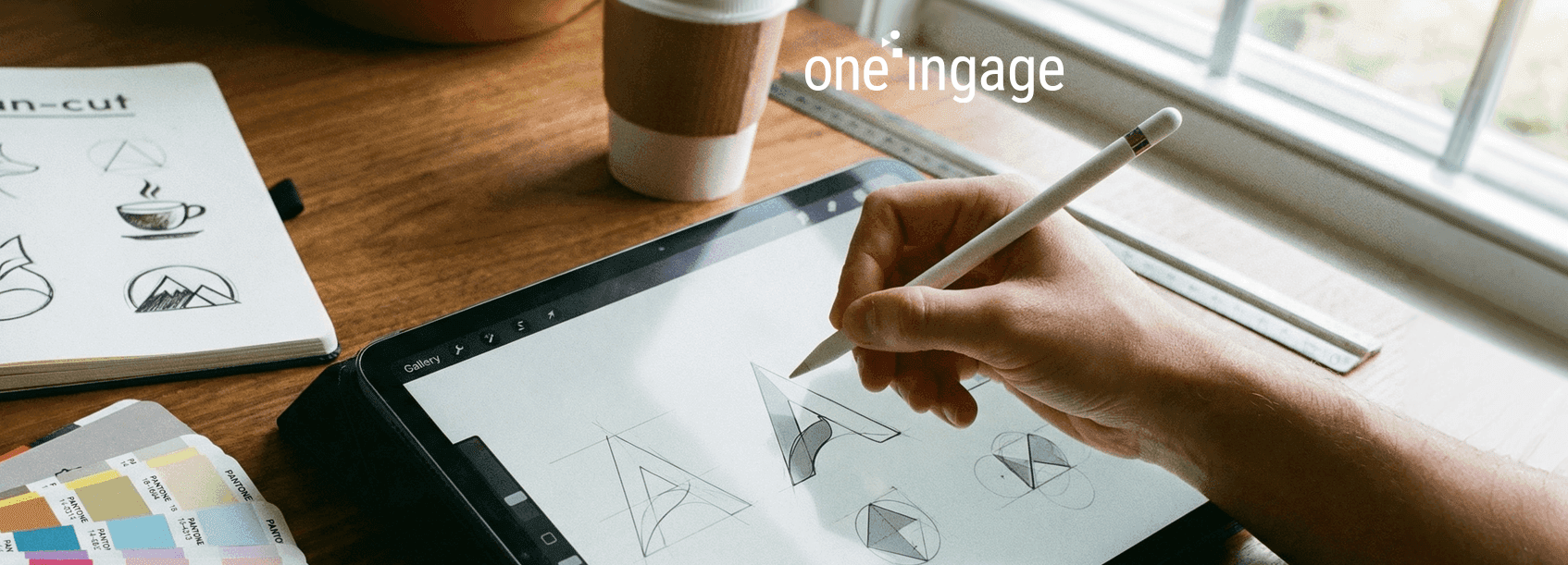
Sketching on paper or tablet allows you to explore many options quickly without getting lost in software details. You can iterate on shapes, layouts, and symbol ideas before investing time in polishing. At this stage, quantity matters: even rough, messy sketches often lead to the most original solutions.
After selecting promising concepts, you begin to align them with a color palette, typography, and key shapes that express the brand’s personality. Color psychology, contrast, and accessibility all play a role, and the typography choice should support the brand voice—serious, playful, luxurious, or innovative. This is where strategy and aesthetics meet.
To guide choices, consider:
When a direction is chosen, you recreate and refine the logo in vector-based software so it can scale cleanly to any size. Here you pay attention to spacing, alignment, grid systems, and curve quality. You also create key variations, such as full logo, icon-only version, horizontal and stacked layouts.
No logo is perfect in the first round, so structured feedback and revisions are essential. Present your concepts in realistic mockups, explain the reasoning behind choices, and listen for recurring concerns rather than isolated personal preferences. Then refine details like spacing, readability, and color balance before moving to final files.
The right logo style depends on your name, target audience, and how you plan to use the logo. A short, distinctive name may work best as a wordmark, while a global brand might benefit from a symbol that transcends language. Thinking about where your logo will appear most often helps you pick a style that fits your real-world needs.
Wordmarks rely entirely on typography to express the brand, making them ideal when the name itself is strong and easy to remember. Lettermarks work better when names are long or complex, condensing them into simple initials. In both cases, the details of the typeface, spacing, and custom tweaks carry a lot of weight.
Brandmarks use recognizable imagery, like an animal, object, or shape, to represent the brand. Abstract marks rely more on geometric forms and subtle symbolism to convey mood or concept rather than a literal object. These styles are particularly powerful when paired with strong brand awareness, because over time the symbol alone can stand for the whole company.
Emblems look like badges, seals, or crests that lock text inside a shape, and they are common for schools, government bodies, and heritage brands. Combination marks pair text and symbol in a more flexible way so the elements can sometimes be used together and sometimes separately. For newer brands, a combination mark is often a safe choice, providing both clarity and visual personality.
Mascot logos are character-based marks that humanize the brand and make it more approachable, especially for sports teams, entertainment brands, and family-oriented businesses. Dynamic logos, on the other hand, function as a system that can change color, pattern, or shape while remaining recognizable. These are useful when a brand wants to appear innovative and flexible across many touchpoints.
Typography and color have a huge impact on how a logo feels before a word is even read. The same word set in a different font or color palette can shift from playful to premium or from traditional to cutting-edge. Choosing them carefully ensures that the logo’s emotional tone matches the brand strategy.
Fonts carry personality: serif typefaces can suggest tradition and authority, while sans-serif fonts often feel modern and minimal. Display fonts bring strong character but may be harder to read in small sizes, so they are best used in combination with simpler supporting type. Make sure the chosen font is legible across devices and has enough weights to support future design needs.
Colors trigger emotional and subconscious responses, which is why they are central to logo design and branding. Warm colors may signal energy and excitement, while cooler tones can evoke trust, calm, or professionalism. Consistent use of a considered color palette helps reinforce recognition and strengthen brand associations over time.
Even the best concept fails if the logo is hard to read or gets lost on different backgrounds. Good contrast between logo elements and their surroundings ensures clarity in both digital and print environments. Balancing type, icon, and spacing creates visual harmony so nothing feels too heavy or too weak.
Today, logo design can be done with professional desktop tools, browser-based apps, or automated generators. The right choice depends on your budget, skill level, and how much control you want over the final result. Regardless of the tool, the underlying design principles still matter more than special effects.
Professional designers typically work in vector-based software such as Adobe Illustrator or CorelDRAW. These tools offer precise control over shapes, paths, typography, and color, making it easier to create clean, scalable logos. They also integrate well with other design workflows for brand guidelines, packaging, and digital assets.
For small businesses or beginners, simpler tools like Canva, Looka, or Hatchful provide templates and drag-and-drop interfaces. They lower the barrier to creating a first logo, especially when time or budget is limited. However, it is important to customize templates enough so your logo does not look generic or identical to other brands using the same platform.
AI logo makers and generators can produce many options quickly based on a short brief. They can be useful for exploring directions or getting early-stage inspiration, but they may reuse similar shapes and layouts across many brands. If you use these tools, treat their output as a starting point and refine it to ensure originality and strategic fit.
Certain mistakes come up repeatedly in logo projects and can seriously weaken the final result. Being aware of these pitfalls makes it easier to spot them in your own work or in concepts you receive from a designer. Fixing them early saves time and avoids expensive rebranding later.
Too much detail, shading, or visual effects can make a logo hard to reproduce and recognize. Similarly, designs built entirely around a short-lived trend often feel outdated very quickly. Aim to reduce your logo to its essential idea and keep decorative elements to a minimum.
Using too many fonts, unreadable scripts, or clashing colors can make a logo look amateurish. Low contrast between text and background also harms accessibility and visibility. A small, well-chosen set of fonts and a disciplined color palette usually look more professional than an overloaded design.
A logo that only looks good on a large screen but fails on a mobile app icon or social avatar is a problem. Forgetting to test one-color versions, small sizes, or dark backgrounds can lead to awkward workarounds later. Building versatility into the design from the start keeps the logo functional across all platforms.
Before you sign off on a logo, it deserves a proper test drive. Testing reveals issues with readability, color, or perception that are hard to notice in idealized presentations. Once you are confident in its performance, you can finalize versions and file formats for consistent use.
Test your logo in different contexts: on your website header, app icon, social media profiles, and sample print materials. Review it on several devices and screen sizes to see how it behaves in real-world conditions. This helps confirm that the logo feels like “you” wherever people encounter your brand.
A practical testing checklist:
Feedback from people who fit your target audience is more valuable than opinions from random viewers. Ask them what the logo makes them think and feel, how they would describe the brand based on the mark, and whether it stands out from competitors. Look for patterns in their responses rather than trying to please every individual.
When everything is approved, export your logo in multiple formats and versions. Vector files like SVG, AI, or EPS are essential for large-scale and print use, while PNGs with transparent backgrounds work well for digital platforms. Organize files into clear folders (primary logo, icon, monochrome, etc.) so your team and partners can easily find what they need.
While the principles of good logo design stay consistent, different industries often lean toward certain styles or cues. Understanding these patterns helps you decide whether to align with expectations or deliberately break away. The key is to be recognizable to your audience while still feeling distinctive in your space.
Corporate, legal, and financial brands typically favor clean, minimal logos that convey trust, stability, and expertise. Sans-serif or classic serif typefaces, restrained color palettes, and simple geometric marks are common. Subtlety often works better than overly playful or experimental styles in these fields.
E-commerce and tech companies often use bold, modern logos that feel fast, accessible, and innovative. They may lean into bright colors, rounded type, and simple icons that work well as app icons and favicons. Flexibility and digital performance are especially important since their main touchpoints are screens.
Creative agencies, fashion labels, and entertainment brands have more freedom to experiment with expressive typography and distinctive symbols. Custom lettering, unexpected color combinations, and mascot-style marks are more common in this space. The challenge is to stay unique and artistic without sacrificing legibility or practical usability.
A good logo is simple, memorable, versatile, and appropriate for its brand and audience. It should be easy to recognize, even at small sizes or in one color, and it should reflect the tone and positioning of the business. When these elements work together, the logo becomes a strong foundation for the rest of the brand.
For a professional process that includes research, concept development, revisions, and final file preparation, logo design can take anywhere from a couple of weeks to several months. Smaller projects with fewer decision-makers move faster, while larger organizations with many stakeholders usually need more time. Rushing the process often leads to more revisions or a redesign later.
A logo is a single visual mark, while a brand is the overall perception people have of your business. The brand includes your values, messaging, customer experience, visual identity, and even how your team communicates. The logo is a key symbol of that brand, but it cannot carry the entire brand experience on its own.
Start by clarifying the emotions and associations you want your brand to evoke, then look at color psychology and industry norms. From there, build a small, focused palette with enough contrast for accessibility and multiple use cases, and test it on different backgrounds and screens. Consistency in using these colors will gradually strengthen your brand recognition.
If your budget allows and your brand is a long-term investment, working with an experienced logo designer or agency usually leads to a more strategic and unique result. Logo makers and generators can be useful for very early-stage projects or tight budgets, but their outputs are often template-based and less distinctive. Consider the lifetime value of your logo when deciding how much to invest.


